Kaiapoi
Brand Identity
A new identity for Kaiapoi, translating its river heritage and community spirit into a cohesive, modern visual language.
Developed as part of the Waimakariri District Council's entrance sign project, the identity draws inspiration from local landmarks, history and community, creating a flexible graphic system that can extend beyond signage into tourism, wayfinding and place branding. The result is a contemporary identity that celebrates Kaiapoi's past while looking confidently toward its future.
“Shaped by the river, rooted in heritage”

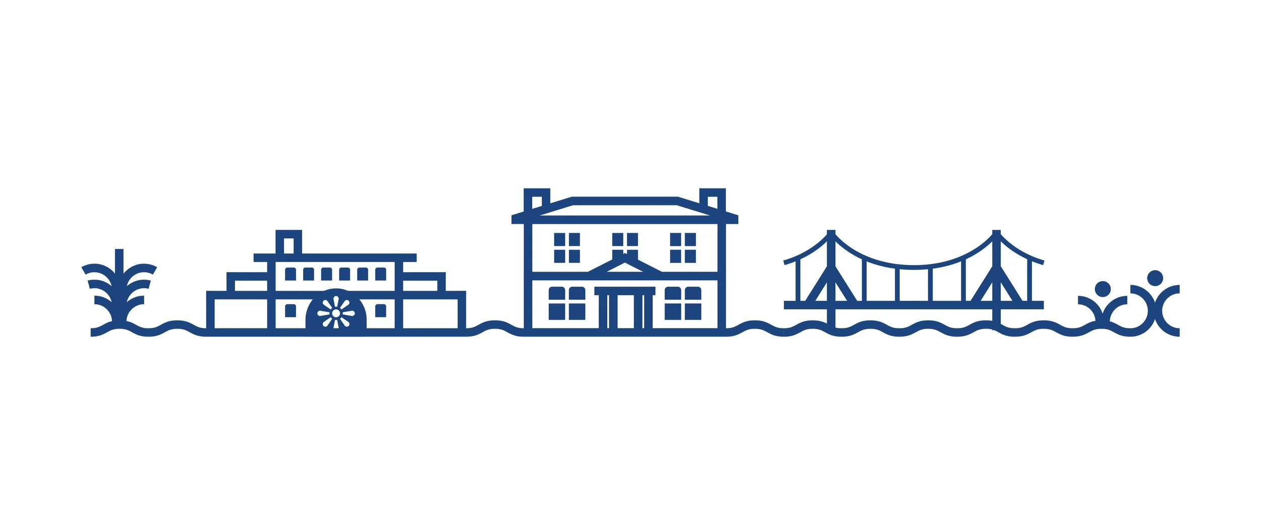
River
The Kaiapoi River is the heart of the town. It represents flow and continuity, shaping its landscape, connecting its people, and sustaining its way of life.
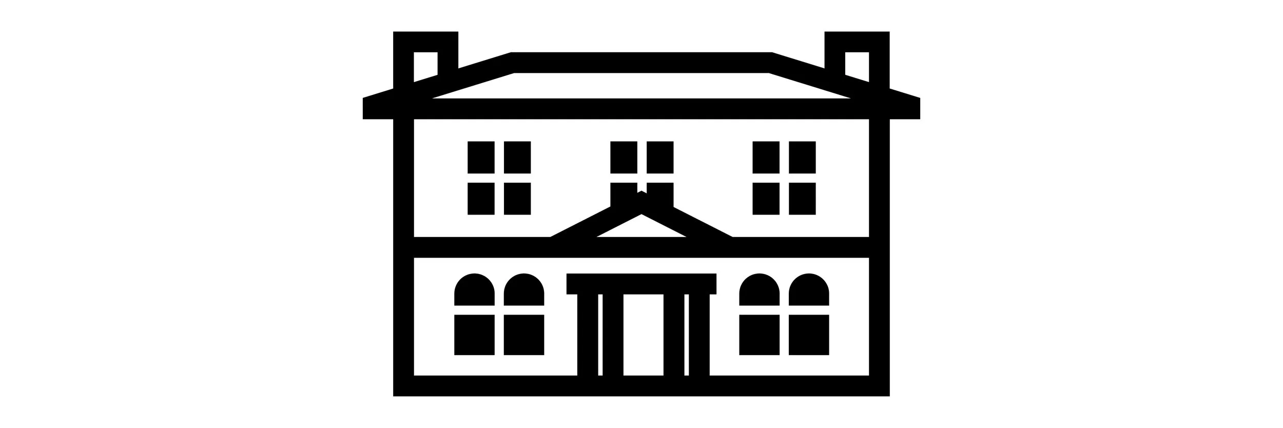
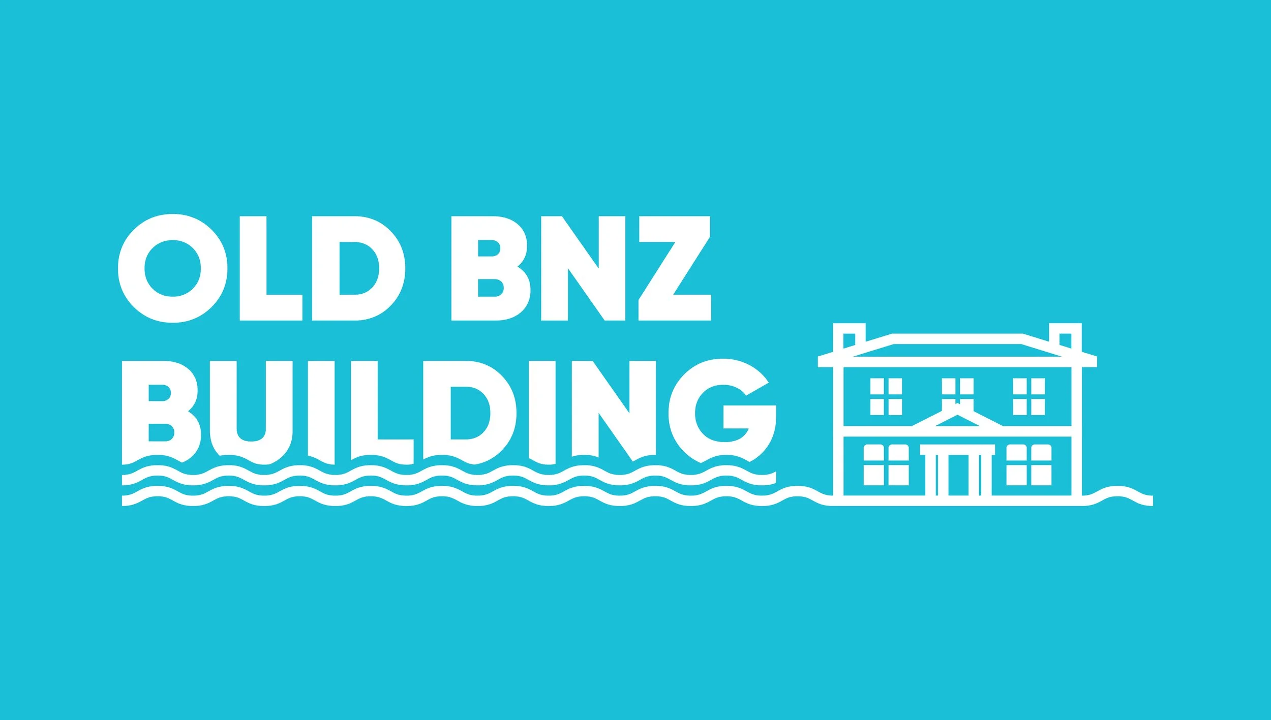
Architecture
Inspired by the former BNZ building, a Category 1 Historic Place, this symbol celebrates Kaiapoi’s architectural heritage, reflecting its character, craftsmanship, and pride.

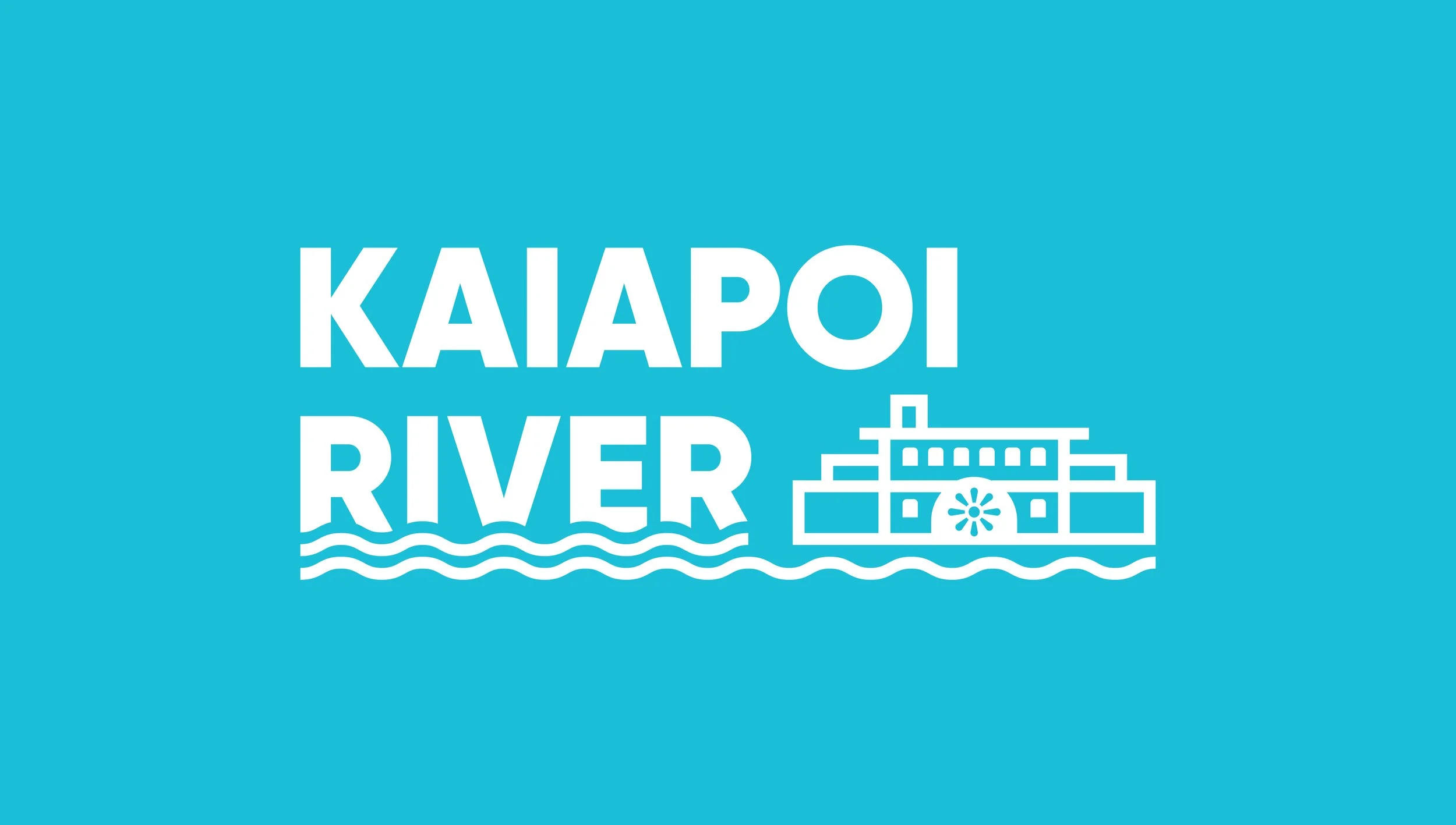
Boat
Inspired by the River Queen, the boat honours Kaiapoi’s deep connection to its historic role as a river port. It also symbolises renewal, carrying Kaiapoi forward with purpose and pride.

Flax (Harakeke)
Growing along the Waimakariri river, flax once sustained Kaiapoi’s way of life, providing fibre, food, and medicine. It symbolises resourcefulness, sustainability, and harmony between people and nature.
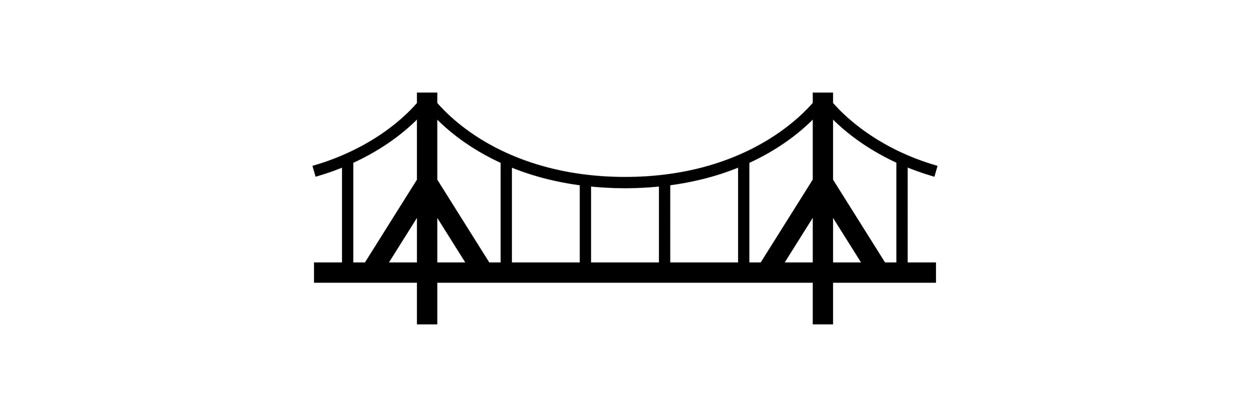
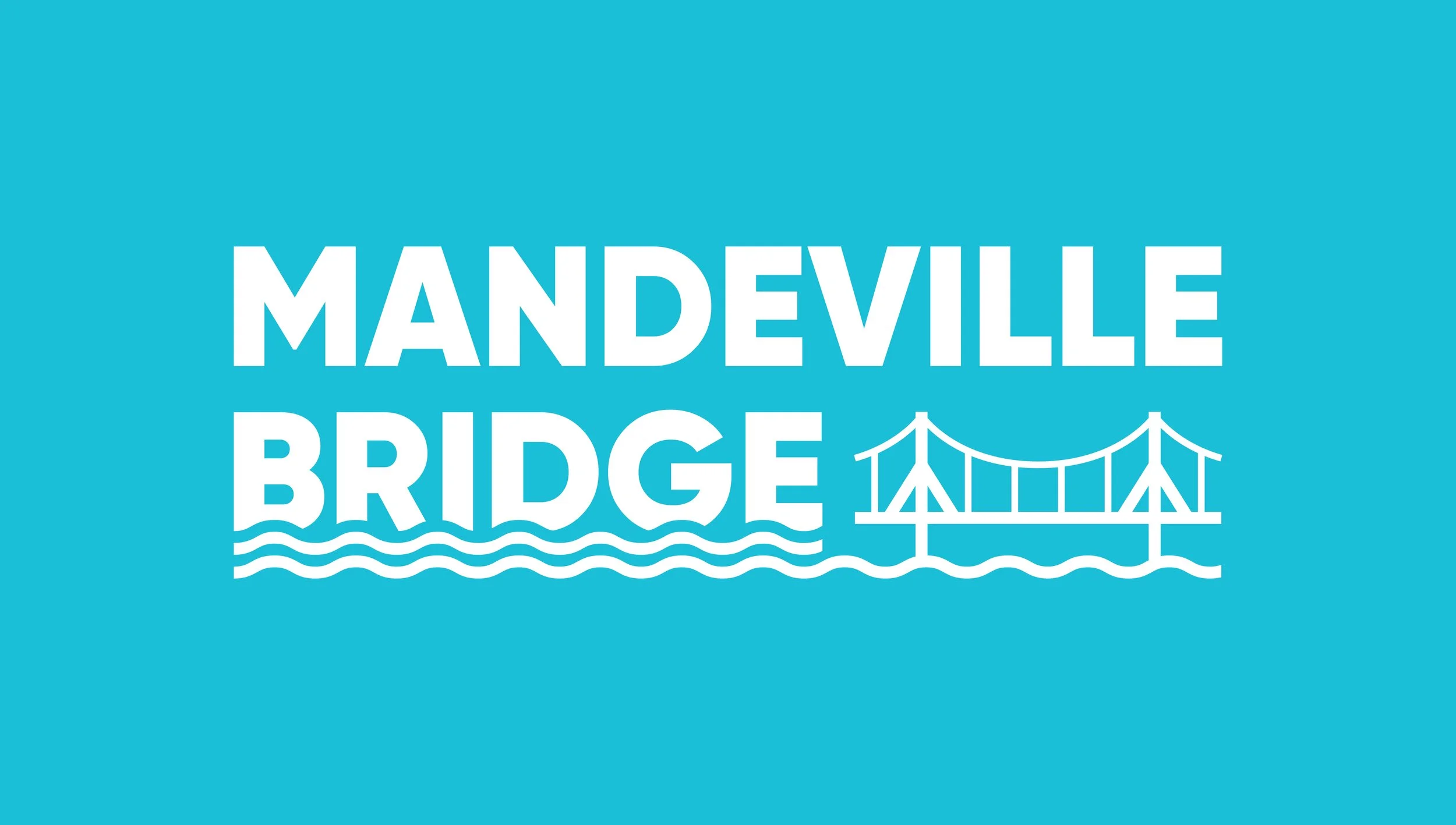
Bridge
Drawing from the enduring Mandeville Bridge – the longest-serving of all Waimakariri bridges – this element represents connection. It reflects how Kaiapoi links communities, uniting people, culture, and opportunity.

People
At the heart of Kaiapoi are its people — whose spirit of resilience, and belonging continues to shape the town. This honours the community’s role in keeping Kaiapoi vibrant, connected, and future-focused.
The proposal was approved by the Kaiapoi – Tuahiwi Community Board in 2026, with installation planned for Q3 2026.